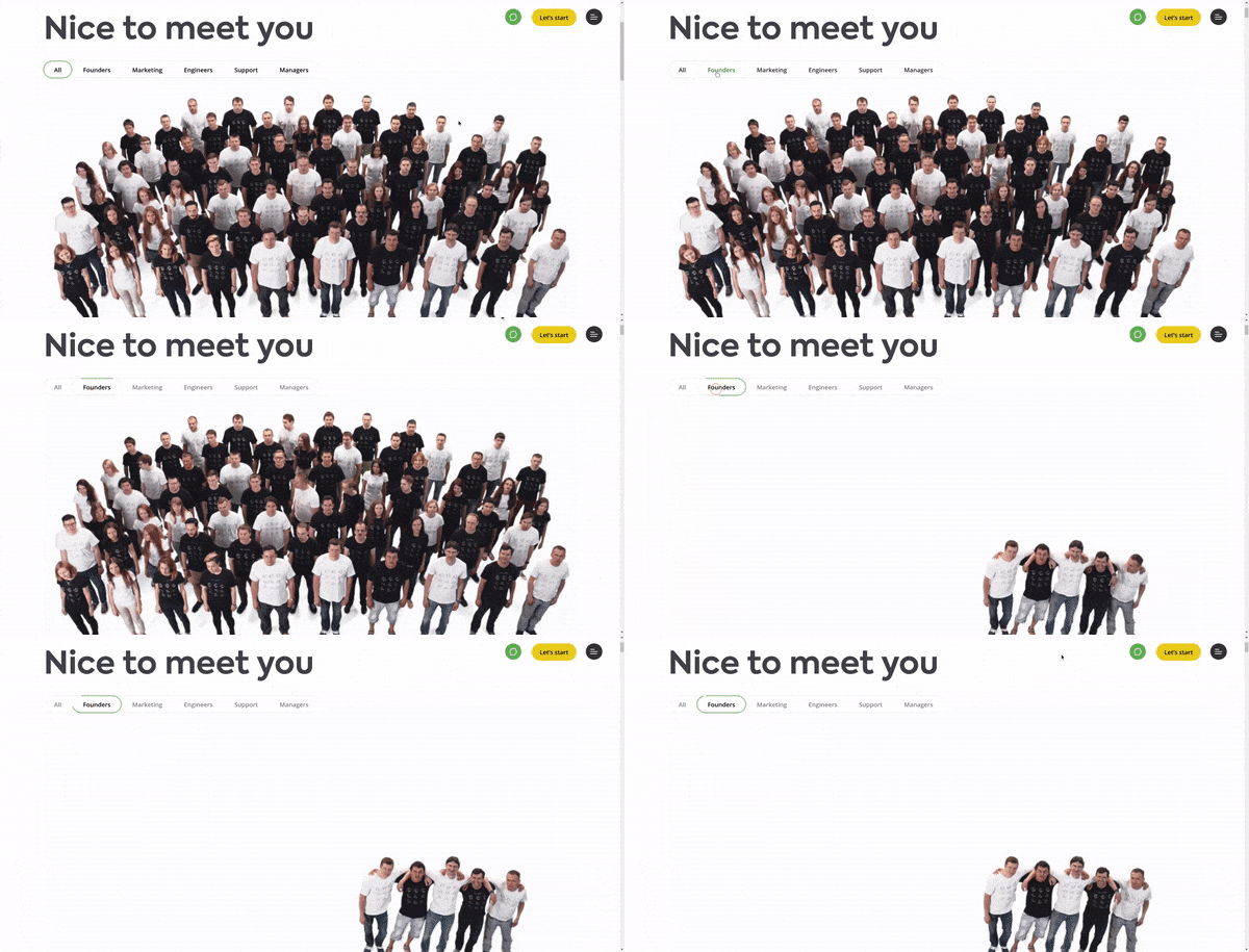
Does your website have a page that demonstrates the spirit of your team? Or does he have no page showing the people behind his company? If your answer was no to any of them, this article is for you.
Visitors who come to your website want to know more about your company and also meet the people who are responsible for your services or products. Having a beautiful team page aligned with your team's team spirit has many benefits: It helps to connect your company with your customer; It boosts your team's morale, since being in the face of the site they will feel even more part of the business; Humanize your brand.
I've put together a list with some examples of very beautiful team pages, some more serious and some more fun, great examples of how this page should convey your company's culture.
Team Pages for Inspiration
- Side
- human
- Khan Academy
- Electric Pulp
- targetprocess
- Wistia
- FCINQ
- Advantix Digital
- Brandand & Mortar
- Digital Silk
- Bleech
1. Side
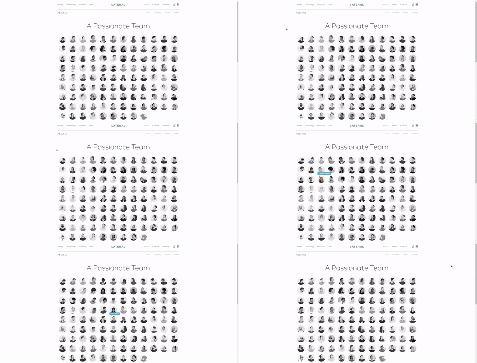
Side is a creative company, focused on design and development studio. Their team page was very well designed, they found a fun solution to accommodate a very large team, as you move the mouse people will follow with the direction of the head and when hovering over a person, their position in the company is displayed.
two. human
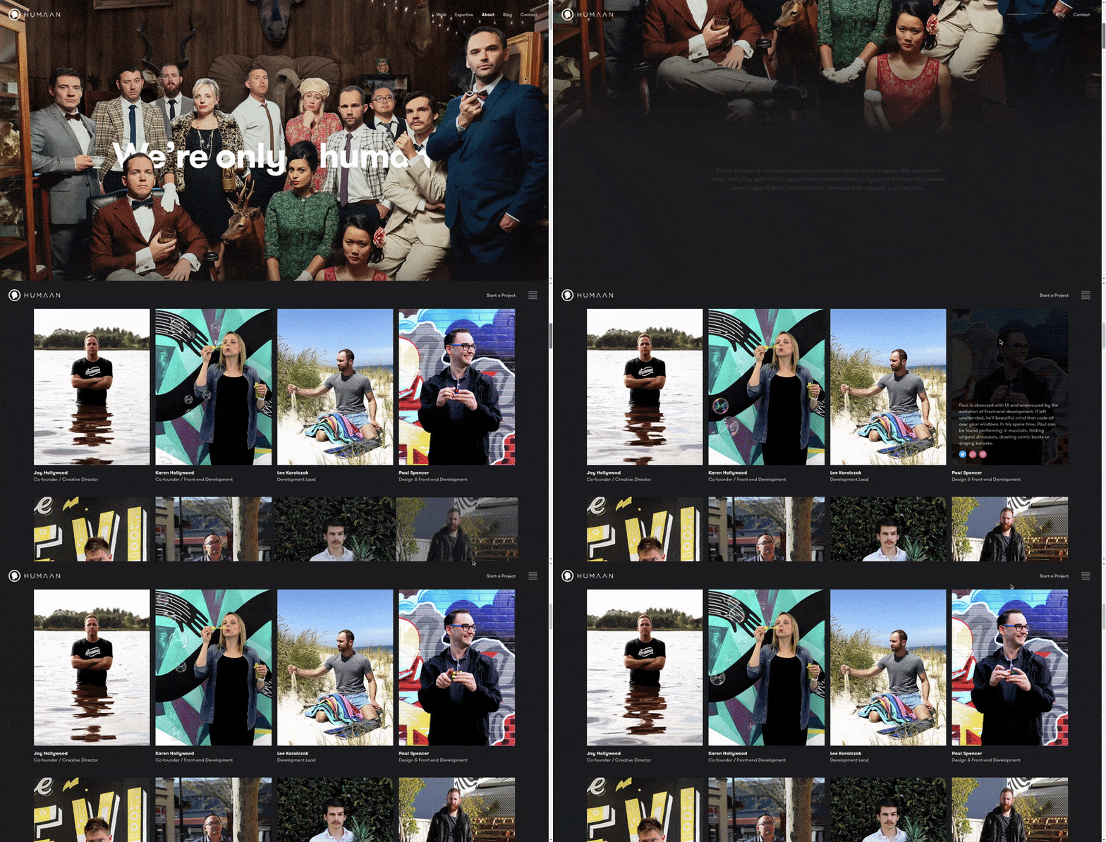
human is a company focused on creating digital products. Your team page is very fun, bringing animated gifs of your collaborators and when hovering over a brief description appears.
3. Khan Academy
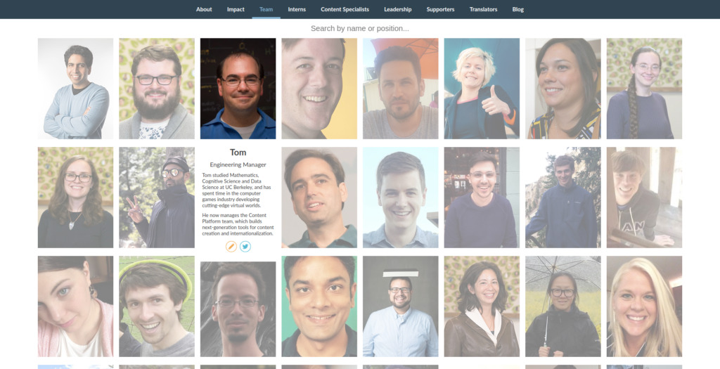
THE Khan Academy offers hands-on exercises, instructional videos and a personalized learning dashboard that enables students to study at their own pace, in and out of the classroom. Your team page has a somewhat simple but cheerful design, allowing you to search by person or position.
4. Electric Pulp
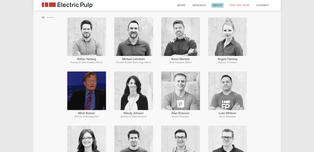
Electric Pulp is an agency focused on digital products, design and development. With a very creative page, it brings all its collaborators and when hovering the mouse it displays, in what I assume, a gif that the person most identifies with.
5. targetprocess
THE targetprocess is a company focused on helping companies to implement and optimize the Agile methodology. They spent a lot of time on their team page, bringing an animated video featuring their contributors categorized by industry.
6. Wistia
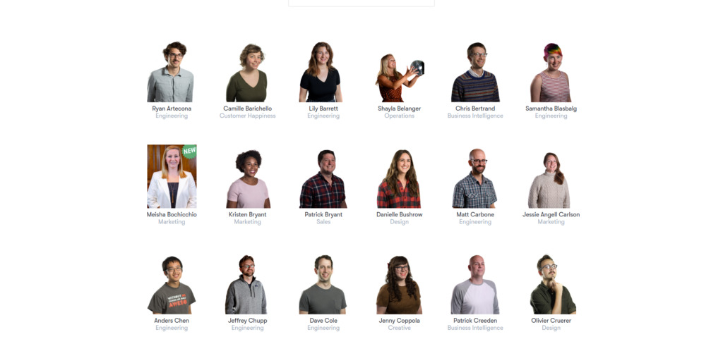
Wisita is a company focused on the development of software, videos and educational content. Their team page has two very fun options, the first showing all their collaborators with their names and their titles, and when you hover the photo comes to life in the format of a gif, the other, they developed a kind of game where each collaborator is the sound of a drum.
7. FCINQ
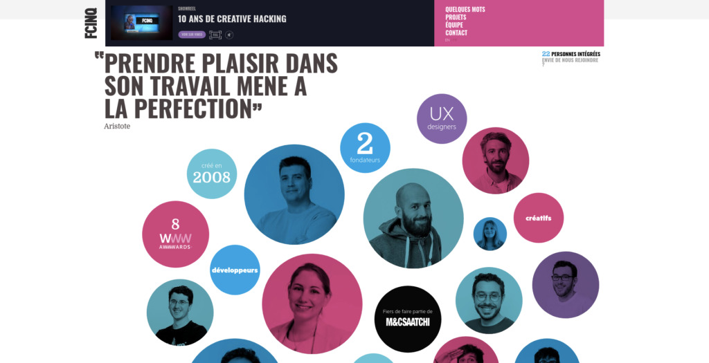
FCINQ is a French creation studio, brought the combination of its visual identity with the presentation of its collaborators.
8. Advantix Digital
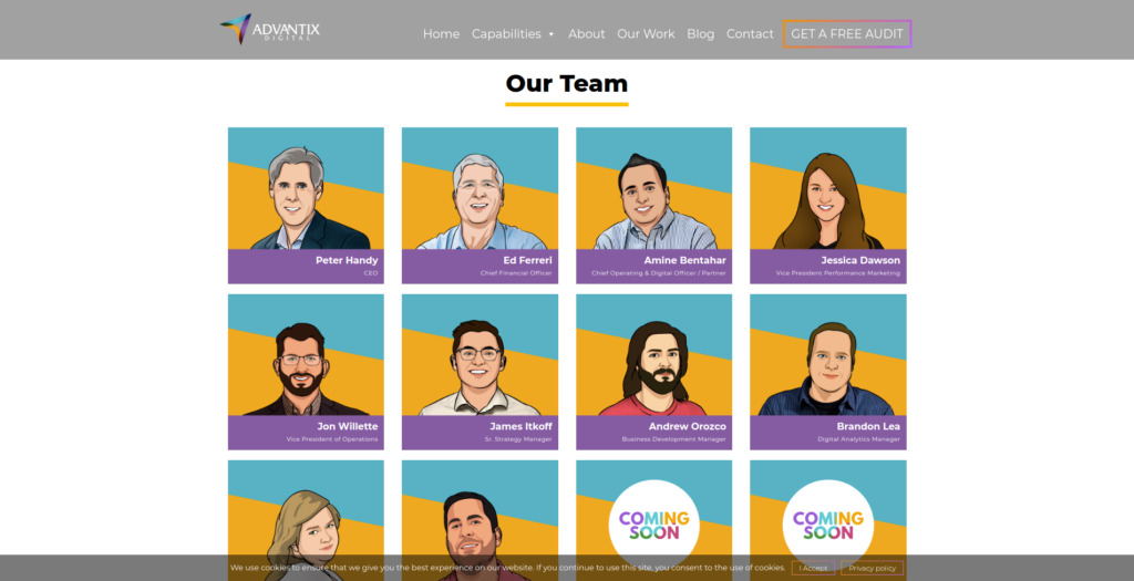
Advantix Digital is a digital agency that knew how to make good use of its resources, having its designers draw caricatures of each employee, a good option for companies that do not want to take pictures.
9. Brandand & Mortar
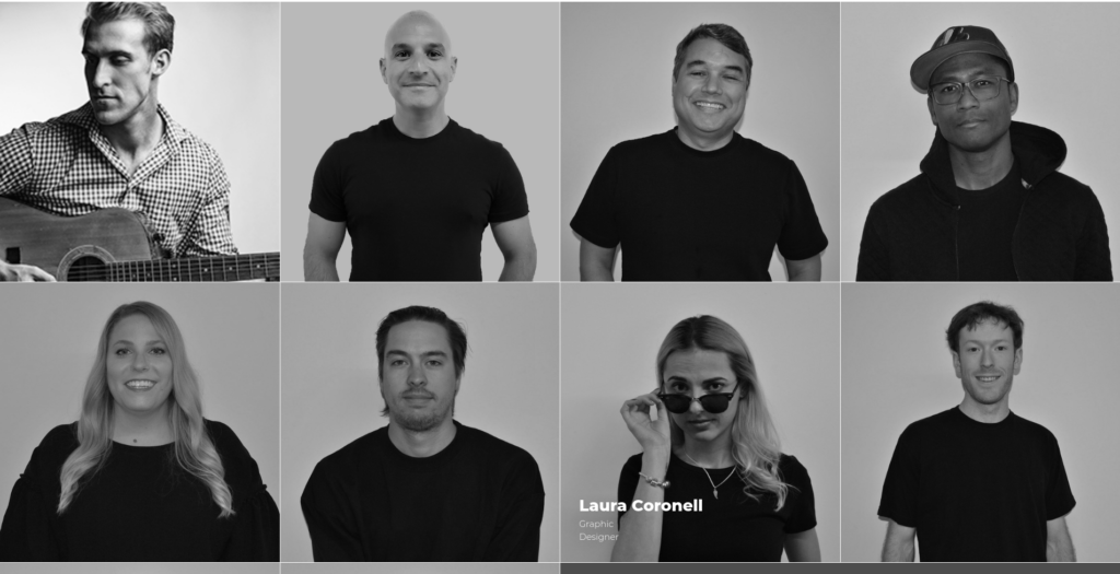
Brandand & Mortar is a specialist marketing company. Brought to your team page a semi-professional solution, with black and white images varying with a fun pose on mouseover.
10. Digital Silk

Digital Silk is a digital consultancy, and it brought all the sobriety that a consultancy normally gives to its team page.
11. Bleech
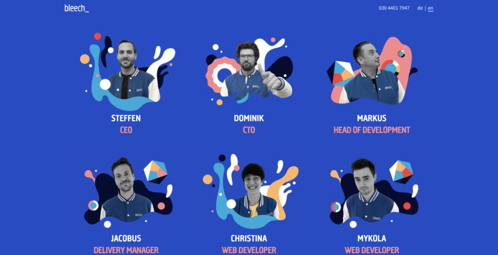
Bleech is a development company from Berlin. It mixed photos and graphics on its team page, bringing a fun look with a modern feel.
Conclusion
There are several ways to create your team page, we've seen some fun examples and others more sober, just identify what feeling you want to convey to your users and hands-on!
0
votos

