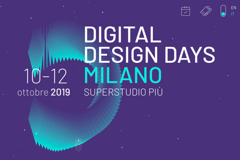
There is a saying from the fashion world that applies to design trends in the online world: "Fashion is cyclical" . If you stop to notice, you will see that from time to time, things that we used to think are tacky are back in fashion on the internet, an example of which is the GIFs, harshly criticized and judged, today they have become part of us.
So what to expect in 2020 for Web Design? An interesting thing that we can notice in the topics is how the UX has been increasingly impacting design trends, changing both the way of interaction with the user and the presentation of information for the same, today more than ever design has a role fundamental in converting users.
1. Dark Mode
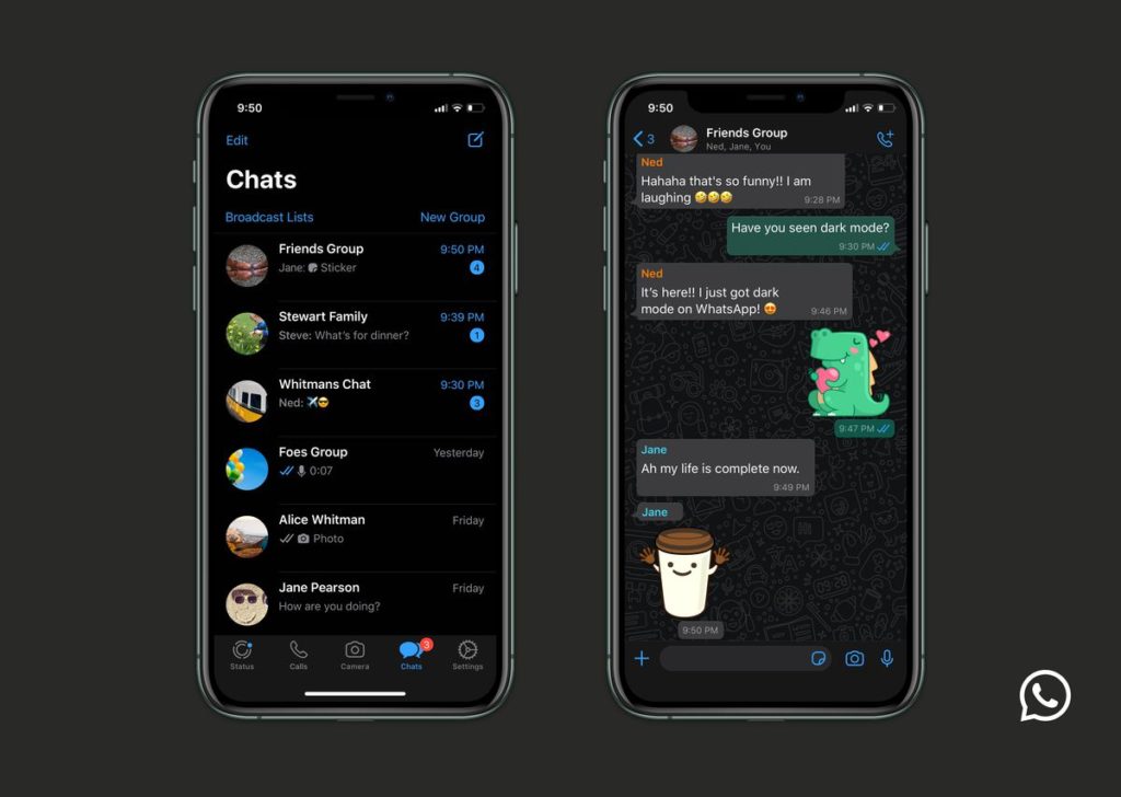
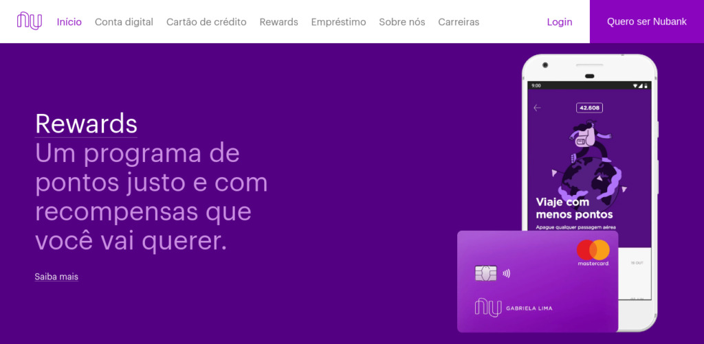
Designs in dark mode look ultra-modern, are easy to see and emphasize colors and design elements. Well known by developers, the "hacker" mode has been attracting more and more users.
This is a trend that goes beyond beauty, there are practical principles behind it too. Dark themes are best for OLED screens, they save energy and prolong screen life. And another thing many people don't know is that dark backgrounds lessen eye strain and improve the visibility of other accent colors for a truly dynamic design. We will see more and more companies embarking on dark modes, recently we had the case of WhatsApp releasing this feature for its users.
two. Soft Shadows and Floating Elements


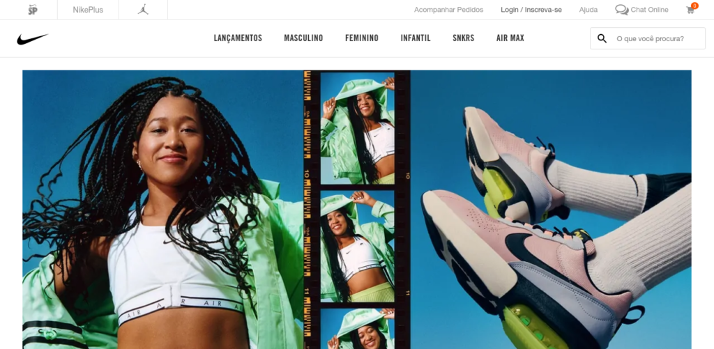
Following the wave of Google Material Design , the bet for floating elements and with soft shadows is certainly guaranteed. This trend brings web pages, without exaggerating, a little depth and a 3D feel.
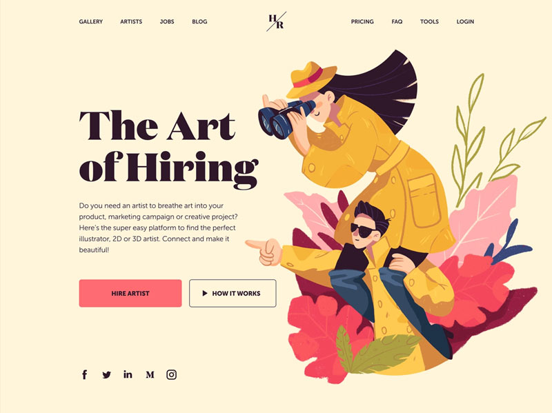
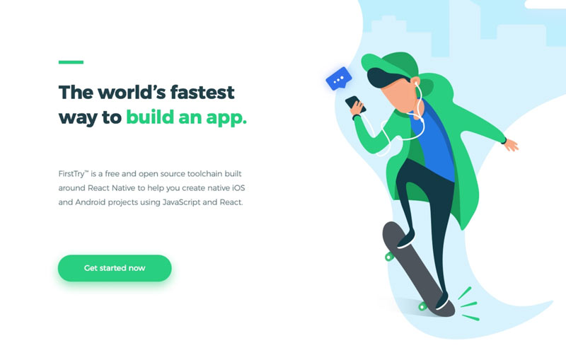
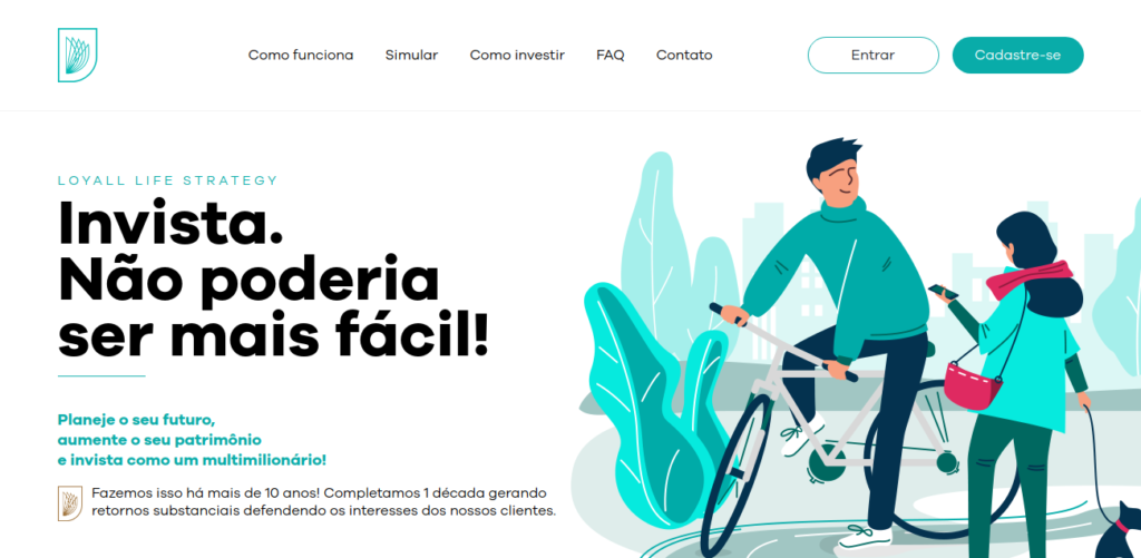
3. Custom Illustrations
Today, visuals don't just exist to give color to your pages, you can and should use them to create an identity and what message you want to convey to your audience.
Of course, putting an illustration in the right place can make a huge difference. They manage to give a bold and modern tone, or you want a more sober and traditional tone, it's up to you! You can even find amazing illustrations in free image banks like UnDraw it's the OperaDoodle.
4. solid framing
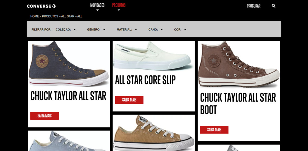
Reminiscent of a picture frame, or even that cool T-shirt with a simple photograph printed on the chest, framing has become a growing trend. You can find this template on many websites and especially online stores. Its clean and organized structure separates the contents well and favors the focus on what is important!
5. Vibrant and bright colors
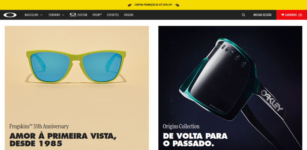
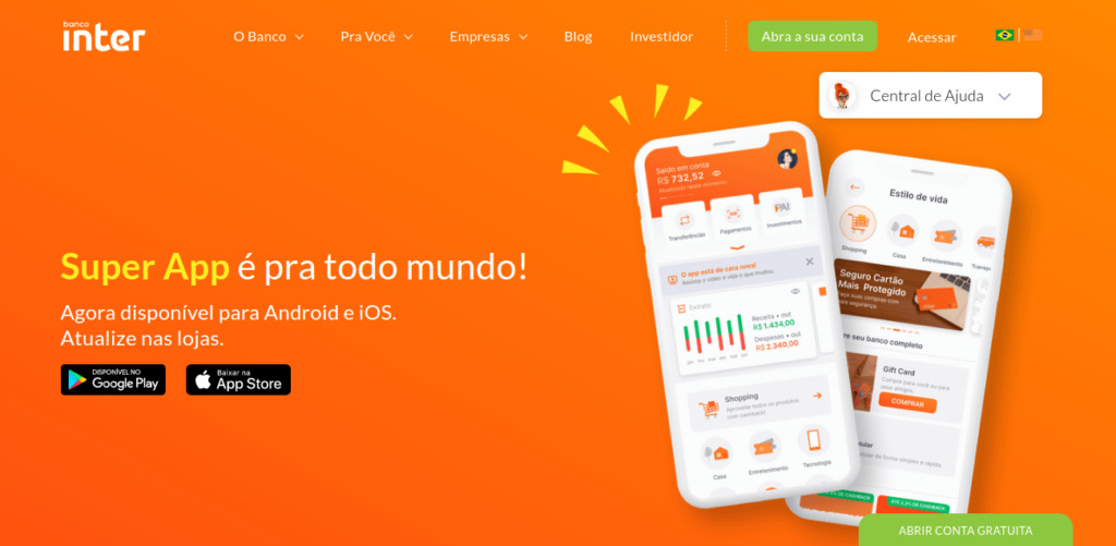
A trend that needs to be used very carefully, the line is fine between tacky and flashy. The use of strong and luminous colors develops a modern and bold look, if used in the right way, it can delight your audience.
0
votos
